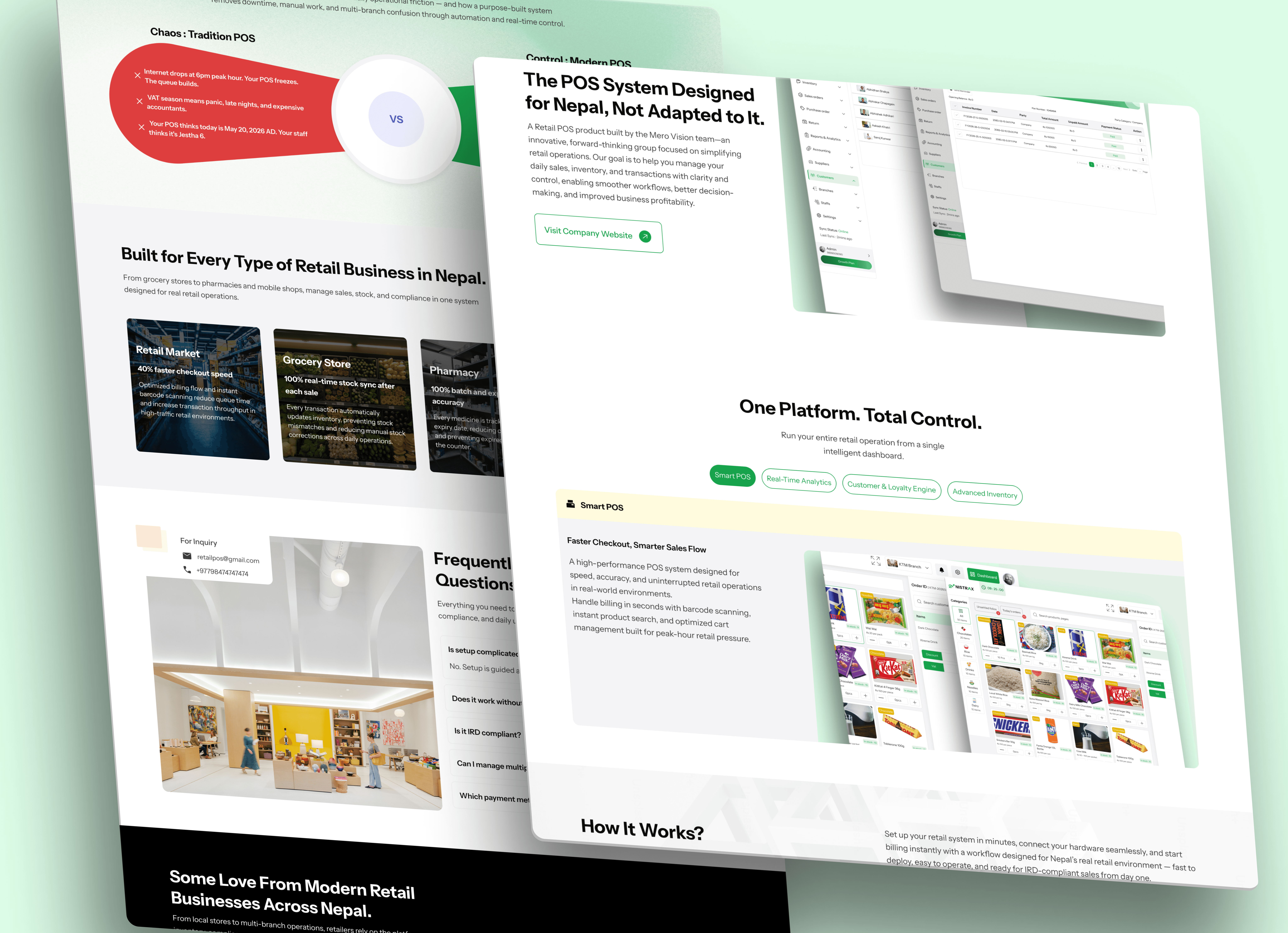
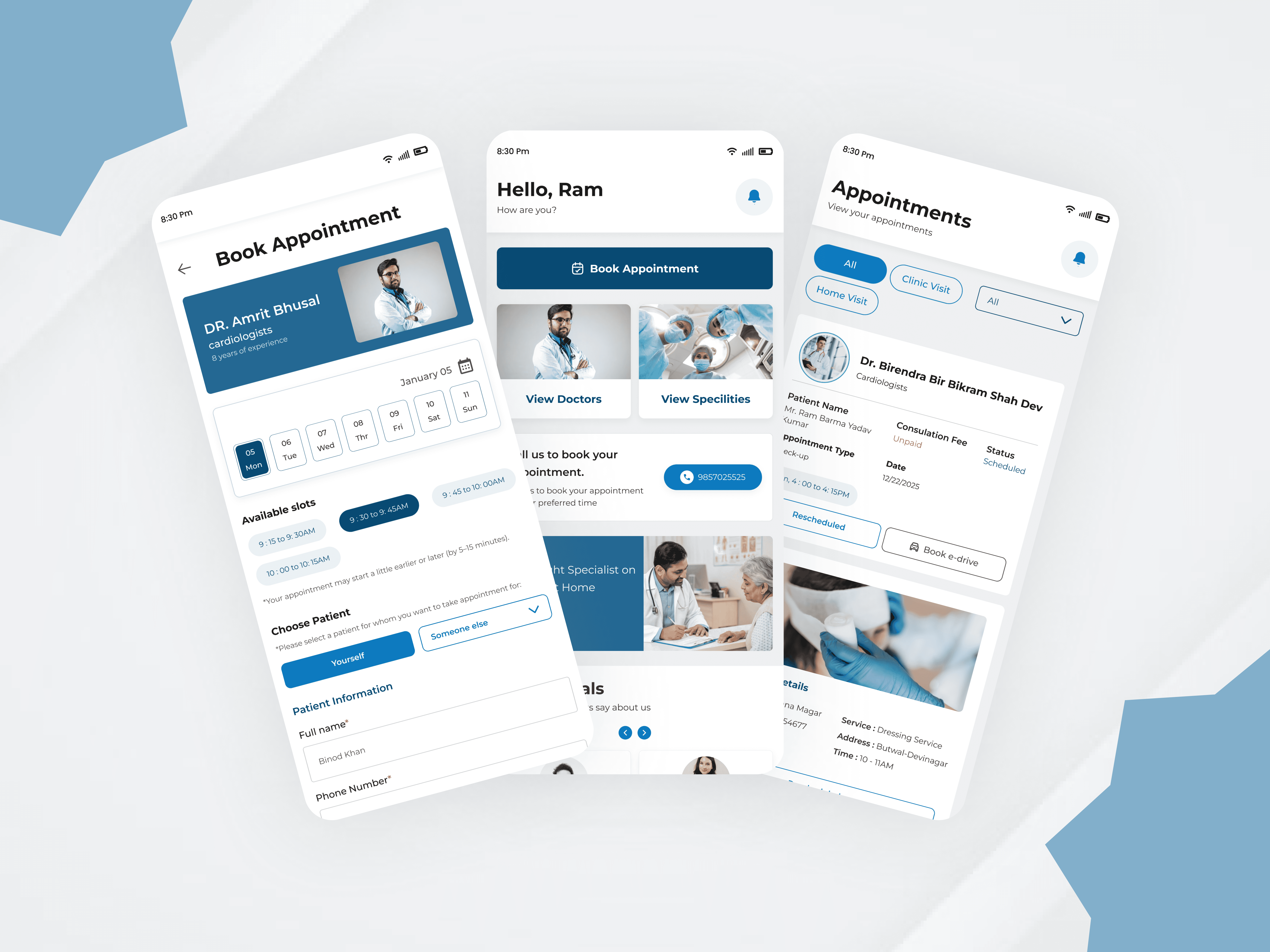
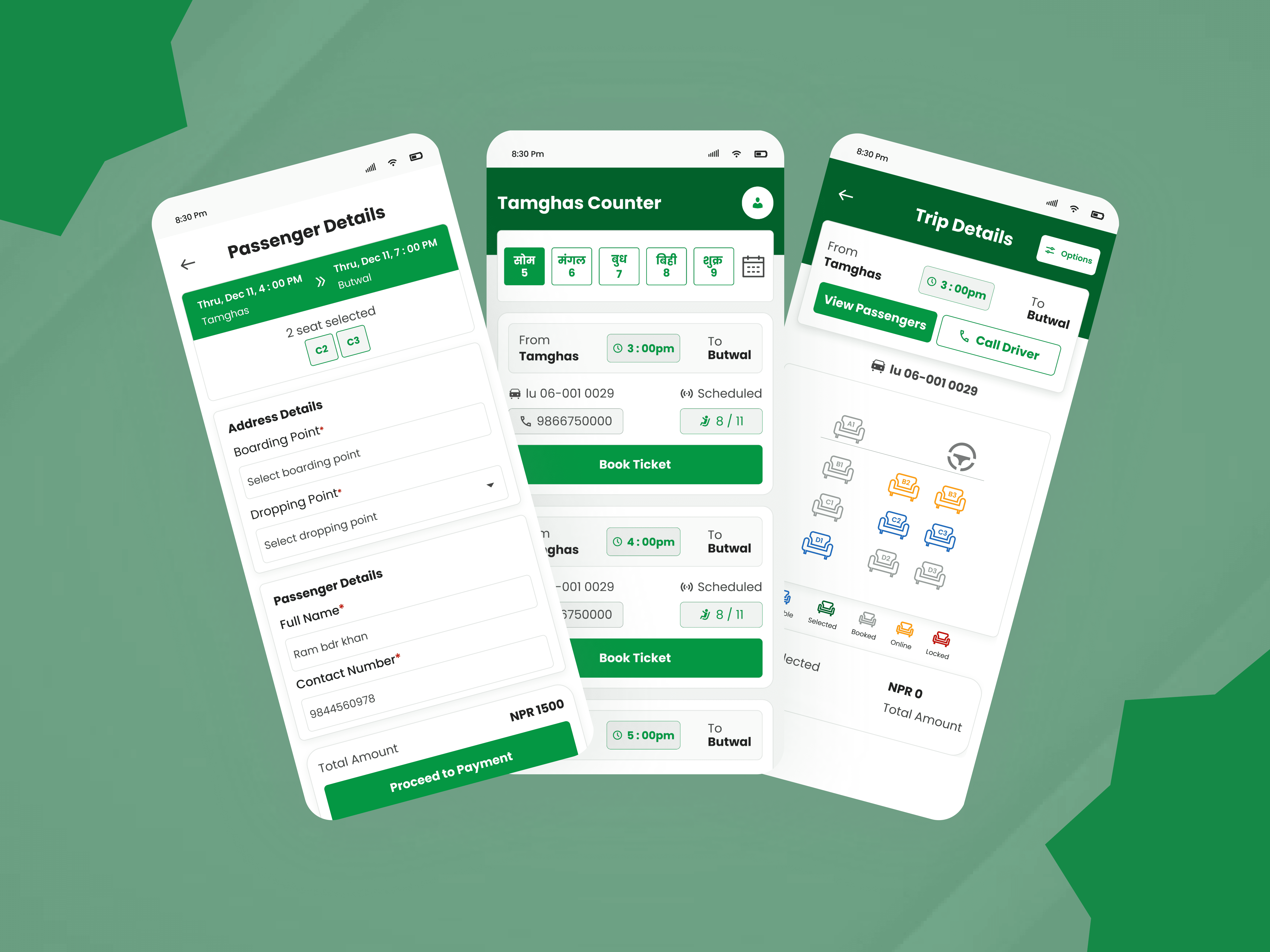
Designing a retail system around how Nepal actually operates Nistrax is a retail management platform built for businesses ranging from single stores to multi-branch operations. It brings POS, inventory, branch management, customers, permissions, dashboards, accounting, staff management, and business administration into one system. I joined the project as the sole product designer, responsible for taking it from research and structure through UI, design system, branding, website, documentation, and developer handoff. The challenge wasn't simply making a POS interface. The product had to work around the realities of Nepalese retail — IRD/CBMS-compliant billing, 13% VAT, Bikram Sambat dates, offline-first operation, and local payments such as Fonepay, eSewa and Khalti — while remaining simple enough for users with limited technical experience. And I had 20 days to design it.
A compressed timeline demanded a clear process The requirements were broad, but the product structure wasn't defined. I had to quickly understand the business, identify the different users and workflows, establish the information architecture, and turn that into a coherent product. I worked through the process in a tight loop: Research → Plan → Design → Validate with the owner → Refine → Finalize The speed came from reducing ambiguity early rather than skipping the design process. I worked intensively through research, planning, flows, and design, while maintaining frequent communication with the owner. Major decisions could be validated quickly before moving deeper into the product. This allowed me to move from an initially broad requirement to a structured product without treating the 20-day deadline as a reason to design blindly.

Designing for the person actually using the product
The POS started as a visual exercise. It became a usability decision.
My first direction for the POS leaned toward a modern, highly visual interface — similar to the vibrant, trend-led interfaces commonly seen on Dribbble.
It looked good.
But the more I considered the actual environment, the less appropriate it became.
The primary users were Nepali cashiers and shop owners. At a POS counter, unfamiliar visual patterns can introduce hesitation and slow down a task that needs to be fast and predictable.
So I changed direction.
I rebuilt the POS around clarity, visual separation, and familiarity — separating billing, product selection, and transaction-related actions into a structure that was easier to understand at a glance.
The visual language remained modern through colour, typography, and component design, but the layout was driven by the task rather than the trend.
The trade-off: less portfolio-oriented visual novelty, more focus on the actual retail workflow.
Making two calendar systems feel like one product
Date handling was another Nepal-specific problem.
Nistrax needed to support both Bikram Sambat and English/Gregorian dates, because business information such as sales, records, reports, and historical data needs to remain understandable regardless of the calendar a business uses.
Instead of displaying both date formats everywhere, I designed a simple date-switching feature that lets users change the calendar and view the corresponding information in that format.
This keeps the interface consistent without forcing users to interpret two date systems simultaneously.
For the dashboard, I also avoided creating a dense screen where sales data, records, analytics, and multiple date formats compete for attention.
I structured the information into ordered sections so the owner could focus on the information relevant to the task.
The trade-off: fewer competing elements on a single view in exchange for a clearer hierarchy and controlled date interaction.

One system behind different retail operations
Nistrax wasn't just a billing screen.
The product had to connect the day-to-day work of a cashier with the broader operational needs of a business owner.
The system supports:
IRD/CBMS-compliant billing and automatic VAT calculation
Offline-first checkout with automatic synchronization after connectivity returns
Fonepay dynamic QR, eSewa and Khalti
Bikram Sambat and English/Gregorian date support
Inventory, barcode and label printing, expiry tracking and variance reporting
Purchases, expenses, sales returns and purchase returns
Multi-outlet management and stock transfers
Accounting and finance, including daybook, trial balance and P&L
Staff attendance, duty roster, shift scheduling and payroll
Customer loyalty points, offers and promotions
SMS and email marketing based on customer purchase history
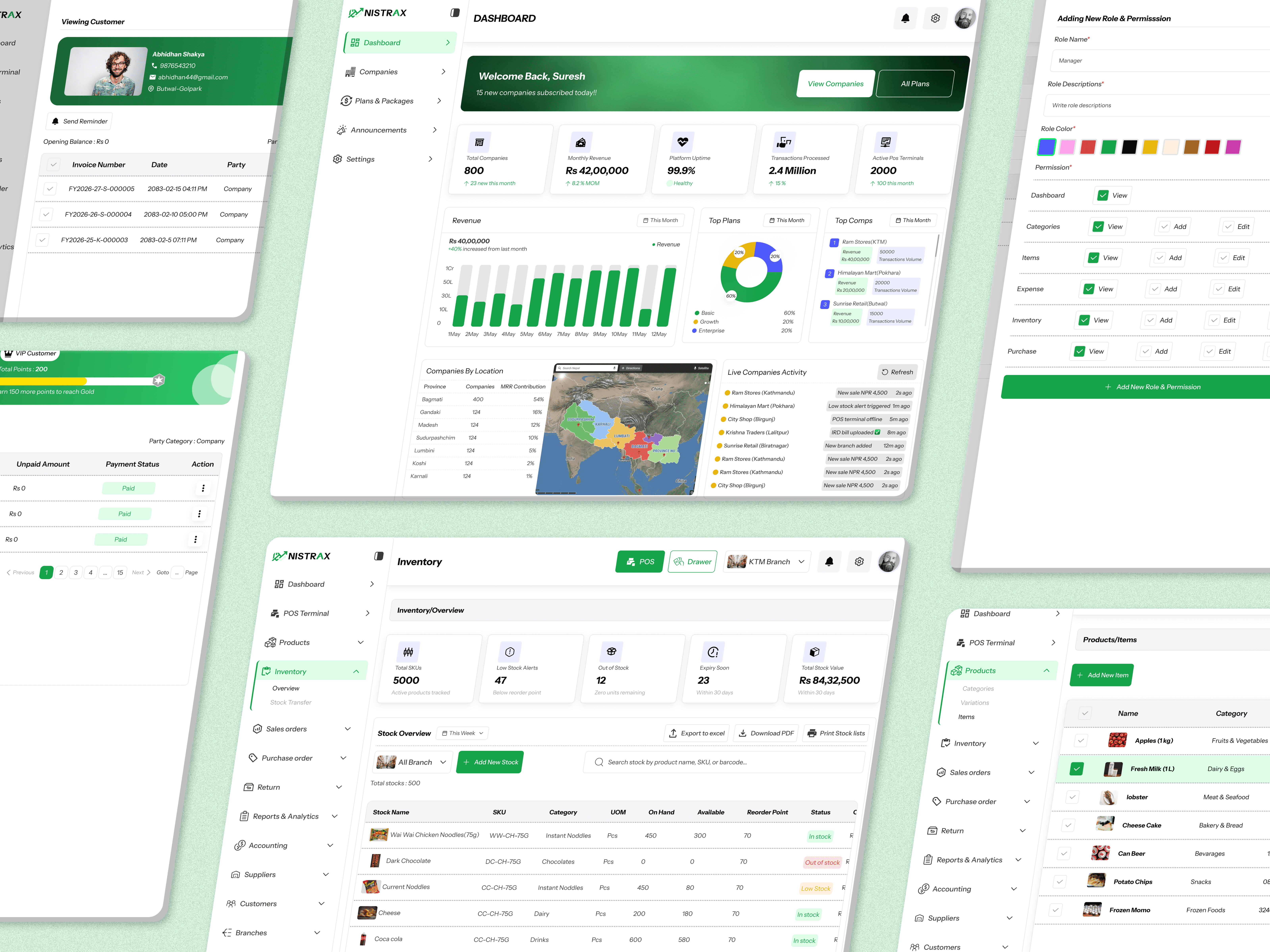
The POS remained deliberately simple for the cashier, while the administrative side provided the depth required to manage products, stock, customers, staff, permissions, branches, sales, and business performance.
Designing beyond the transaction
I also identified opportunities to bring customers back through loyalty programs, customer messaging, and VIP customer management.
These weren't treated as isolated features. They were designed as part of the broader retail system — connecting customer activity with the business's existing sales and customer data.
Building the system while building the product
To keep the experience consistent across the product, I built the design system alongside the interfaces.
It included:
Colour styles · Typography · Buttons · Cards · Form elements · Reusable patterns · Component variants · Prototypes
The system allowed common patterns to be reused across the POS, dashboards, and management areas instead of solving the same interface problem repeatedly.
Making the handoff executable
The handoff wasn't just a Figma file.
I documented the design system, features, user flows, and how different parts of the product work, alongside the high-fidelity designs and prototypes.
This gave the development team a reference for both what to build and how the experience was intended to behave.
I continued supporting development by clarifying design decisions and product behaviour during implementation.
Reflection
Complexity doesn't have to disappear from the product. It has to disappear from the user's experience.
The 20-day constraint reinforced something important in my process: speed comes from clarity, not from skipping decisions.
Research and planning established the structure. Fast validation with the owner reduced uncertainty. The design system reduced repetition. Documentation reduced ambiguity during development.
The product is now live, but post-launch user validation remains an area I would continue to investigate.